
Your typical Trinity Study / 4% Rule style portfolio longevity analysis requires a full 30+ year period to determine retirement success. If the portfolio value was still positive after 30 years of spending, you passed. If you ran out of money, you didn’t…amongst other things.
Since we don’t have a full 30 years’ worth of data for people retiring in 2000 or 2008, the most recent scary dates, these periods are left out of the pass/fail statistics of the most common retirement calculators. [The most recent possible start date is 1989 (1989 + 30 = 2019)]
This dearth of data is exacerbated for early retirees since we expect our retirements to be much longer than 30 years. [The most recent start date for a 50 year period is 1969 (1969 + 50 = 2019.)]
But let’s see how these retirees would be doing mid-stream, and compare to other difficult times in history.
How are the 2000 and 2008 retirees doing?
In the US historical record, the worst times to retire were 1929, 1965 (+/- a few years), and it turns out 2000 (not so much 2008.) These periods either faced a significant stock market drop right out of the gates or were hit with the double whammy of high inflation and a stock market plunge mid-stream.
Without further ado, let’s look at a couple of charts.
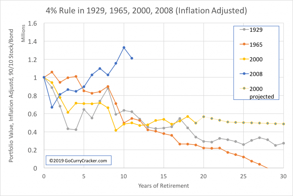
Each of these charts shows the portfolio value over time for a $1 million 90% stock / 10% bond portfolio. The first chart shows nominal values and the second is adjusted for inflation.
Nominal pricing charts are interesting to look at in the short term – if I’m just looking at our portfolio value in Personal Capital (affiliate link) or at my brokerage, this is what I see… it takes a bit of mental gymnastics to determine the actual purchasing power of the portfolio / adjust for inflation.
Case in point, if we retired in 2008 (Blue line in the charts) we would have experienced a significant drop in portfolio value followed by a rapid recovery. If I logged into my account in Year 5 it would show me that I had about the same amount of money that we started with. But, that same amount of money would purchase only about 90% of what it would have a few years earlier (see second chart below.)

Inflation-adjusted data is easier to comprehend over the long term. If we just look at the nominal values, a 1965 retiree (Orange line) is looking pretty good at the 20-year point with a portfolio worth 80% of the starting value. But due to incredibly high inflation, those dollars purchase only 20% of what they used to (ouch!) which explains the rapid drop to zero in the nominal chart.

To make it easier to reconcile the short-term nominal values and long-term inflation-adjusted numbers, I find it helpful to simultaneously look at an inflation chart. Here we can see the obvious deflationary period of the Great Depression that followed the 1929 crash and the ridiculous inflation of the 1970s. The steady and predictable inflation from 2000-present look tame by comparison.

So… how are the 2000 and 2008 retirees doing?
The 2008 retiree is looking rock solid. The portfolio recovered quickly from the Great Financial Crisis and is now worth about 20% more than the starting value, inflation-adjusted. Assuming they made it through the recovery unscathed psychologically this cohort of retirees is sitting pretty.
The 2000 cohort is also looking ok with a portfolio worth 10x the annual spend, 15% more than a 1929 retiree at the same stage and 50% more than a 1965 retiree (inflation-adjusted/2nd chart.)
Going forward from here, spending $40k/year from a $400k portfolio could be tough… A 10% withdrawal rate doesn’t have a great long-term success rate (Although if you retired in 1982 you could have spent 9.5% every year.)
But, consider…
– In the 20th year of retirement (2019) inflation is tame, the stock market is up 20%, and the bond market is up 10%, which increases the portfolio ~15% gain even after spending $40k.
– Social Security income is nigh (as is Medicare enrollment for US residents.) Case in point, I will be eligible for early SS at the 24-year mark. The addition of an SS income stream at that point will increase the portfolio value at the 30-year point by $100k+ (a 20-25% boost at this point.)
– Had this theoretical retiree followed my cornerstone suggestion (spend less in the early years (Front-load frugality!) while hacking your taxes) then the portfolio would be worth 30% more after 20 years (end of 2019) –> $575k vs $425k (modeled here as 3% for first 5 years.)
– Average SS income will provide half of a $40k/year budget. (Yes, even for early retirees.)
– Mediocre inflation-adjusted returns of 4%, combined with SS, will result in a portfolio worth $500k at year 30. This supports $40k annual spending for at least another 30 years (SS = $20k, 4% of $500k = $20k, Total = $40k.)
In other words, barring imminent disaster the portfolio will most likely last 50+ years… even in the worst of times a 4% inflation-adjusted withdrawal seems to work (which is why it is called the 4% rule and not the 5% rule.)
NOT BAD for the worst case! It is incredibly robust.
For details on how it worked out in the other terrible times, I recently explored the 1929 scenario and took a deeper look at the 1965 cohort in the post, The Worst Retirement Ever.
(Others have done a similar analysis, most recently (I think) by Michael Kitces about 4 years ago. Differences here include data from the additional 4 years, the use of inflation-adjusted numbers and an exploration of cumulative inflation, and a more early retirement leaning portfolio (higher stock allocation.))
Summary
How are the 2000 and 2008 retirees doing? The 2008 cohort is doing great, and the 2000 cohort is doing better than other terrible times in history but still at the low end. Social Security will come to the rescue.
Me: The 4% Rule is incredibly robust
Them: But whutabout 1929, 1965, 2000, and 2008!? Etc…
Me: waves vaguely in the direction of the text and charts above then goes for a bike ride


Bruh…. Great that you are pushing out content on a reg basis.. I would love to know how that ends up increasing blog related (affiliate, ads etc) revenue. I have to imagine each post has a great revenue half life..?
Dunno brah, I don’t pay that much attention to it.
I’ll do a check at the end of the year. Check out the one for last year: GCC Business Review 2018
Nice, yeah 2000 had me worried for trinity study. So in the US, inflation >4% is seen as high? In our country 4% is very low, 6% is normal and our history shows 10%. So I’ll make sure to keep buying developed market equities since inflation is a problem. It’s somewhat adjusted with currency depreciation, but super volatile.
Also, no Social Security here. Maybe I should just move back to my EU home country and pick that by working there quick… I suppose US citizens still can get SS working outside the US because of citizenship based taxation? Can’t do that if you’re an EU national on a resident tax basis working elsewhere? Time to do some investigations.
Americans working outside the US for non-US companies don’t get SS unless there is a totalization agreement (they also don’t need to pay SS taxes.)
ahh ok, thanks.
I think the 2000 semi-failure just means will have to pick up some work and income to replace (if you can get it), cause when 2008 GFC rolls around I don’t think you’re in the mood to just wait it out and see if the portfolio recovers after the first 35% fall…
I would have been considering options in 2008 also.
But, not a failure or semi-failure. Spending 3% still looked like hell in 2008, so just spending less isn’t a solution to the psychological challenge.
I’d love to see what the graphs look like with a 3% withdrawal rate instead of 4%.
Love the blog. Thanks!
Got it
Then each person just needs to decide if it is worth the delay. See how long it takes to save from 25x to 33x throughout history.
3% looks A LOT better than 4%. I’d be sweating if I retired early in 2000. It looks like 4% is okay for 30 years, but 50 years is a long time. 2008 retiree is looking good.
Well, sure it does. 0.3% looks even better.
Keep in mind this is the worst possible case, you have to remember how in the “You will die before you run out of money” you have a 50% chance to have at least 2x your initial investment by year 30.
If would be a much longer article but if Jeremy were to pick more years than just the worst there is a good chance your feelings about the risk would change.
Another awesome post! Looking forward to a follow up post about these cohorts in 5/10 years…:)
Me too
For the 2000 retiree -by 2019 the inflation adjusted 40,000 annual withdrawals would probably be approximately 60,000. Social security of 20,000 would therefore only makeup for 1/3 of the spending..
It looks the portfolio value is $600,000.
A 40,000 withdrawal doesn’t seem sustainable.
A 40k inflation adjusted withdrawal is…. 40k.
But the Social Security is $20,000 in 2019 dollars, not 2000 dollars. What is the nominal amount needed after social security ?
It’s all inflation adjusted. $20k is $20k
Thanks for the post, as you have previously pointed out, we spend a lot of of time talking about safe withdrawal rates. The truth is “You Will Die Before You Run Out of Money“. If the 2000 cohort was age 50 when they stopped working, there is a 21% chance they are no longer with us in 2019 (using male risk profile). Let the portfolio run out another 10 years and there is a 45% chance of death.
I like this article, especially because we are likely heading towards another economic slump and a lot of potential early retirees might be worried about how their retirement will go if they leave now.
>we are likely heading towards another economic slump and a lot of potential early retirees might be worried about how their retirement will go if they leave now.
Yes, this is why I have been thinking about this stuff.
I’d also like to second with my thanks for these posts, Jeremy. It’s taken me about two years to start getting comfortable with the idea of walking away from a paycheque after reaching my FI goal and I know we’re headed for another substantial downturn. Your analyses are helping allay any fears or doubts I might have about pulling the trigger on my FIRE dreams. Cheers!
How do you know we’re headed for another substantial downturn?
Clarifying my previous comment… my focus is the worry.
You hear all the time that “we are likely headed towards another economic slump.” It’s mostly garbage.
If you look at a historical stock market chart, it is almost always at an all time high.
Really excellent blog post. Loved your previous one entitled “What if it all went to hell?“.
To me the challenging balance that we are all trying to strike is that most people are in situations that are not really so straight forward as the examples present. Not that your examples (and others) are not helpful because they are but life just ofetn is more complex. Take me for instance. Turning 54 tomorrow with a spouse the same age. One kid left to get through college (2 others out). Modest pension at age 65. Reasonable amounts of Social Security at age 67. Approximately $400K away (20% away) in investable savings target for a firm 4% withdrawal rate. Making reasonable money at job that would be walking away from when we pull the trigger. Would love to say screw it (and other less kind things).
Not so straight forward. :)
Your posts are super timely. Thank you!
The future is never straight forward, which is part of what makes it interesting. Alas, there are no guarantees except we will all die.
Very true on both points.
Again really great work!
> This dearth of data is exasperated for early retirees
I’m sure you don’t care, and know it doesn’t matter, but I think you mean exacerbated? Great piece!
I do mean that, yes. Fixed. Thanks for letting me know
Not 2000 or 2008 retirees, instead the wife went out in 2009 and I did the same in 2014. Right now due to early SS (she at 62 and me at 63) our withdrawals are less than 2% on average. We planned our retirement well while I was still working, paying for those things that set us up for extensive traveling and have ourselves set up for 4-5 months on the road per year. No debt, living in a low COL state, and socking away a decent amount while working (even with a child who we made sure entered her post-college life with zero debt as well) generally results in a fairly agreeable lifestyle. BTW, recently read JL Collins “A Simple Path To Wealth“. I believe he spoke highly of yourself; he is a smart man.
>I believe he spoke highly of yourself; he is a smart man.
He is a smart man. This just shows that even smart people are not infallible. ;)
The USA economy, and attached security markets, have become subject to amplifying oscillations induced by lagging phase negative feedback control by the Federal Reserve and Federal Government.
Next time will be different – not.
How can a lagging phase negative feedback system result in amplifying oscillations? https://www.allaboutcircuits.com/technical-articles/negative-feedback-part-4-introduction-to-stability/
Audio feedback squeal from a public address system is a commonly experienced (imperfect) example.
Shall I, or you, attempt to estimate the parameters and predict the outcome?
I’ll defer to you on that one.
I’m loving all the content you’re putting out lately. At 3%, how long did it take for 1965 to be made whole? I’d love to see the earlier 3% chart extrapolated forward to see if the 3% guideline would lead to runaway wealth like in 1965.
I don’t have a chart, but it didn’t runaway… the end of the 1965 cycle roughly feeds into the year 2000 and we know that ended down.
Have you played with cFIREsim? You can run a single simulation cycle for 1965 through present, changing allocation, withdrawal rate, SS income, etc…
Yikes, those inflation numbers seem so foreign having always lived in a benign inflationary environment. Great charts and I am personally sticking to 3% and might ratchet it up higher as needed
Solid plan.
Sounds familiar ;)
Realistically, people aren’t going to withdraw the exact same amount each year. If they have a terrible year, they may decide to adjust — cut expenses, pick up some side income. So it’s nice to know if a withdrawal rate is generally correct, knowing one can tweak in the margins. We converted half of our paper assets to real estate to provide an inflation hedge and a more reliable cash flow. We’re happy with the paper growing in the background.
I turned 45 years old this year. I’ve not spent the same amount of $ in any of those years, so probably won’t start now.
Your last two articles on crashes etc I think are rather pertinent seeing it is on many people’s minds …. it is especially on my mind seeing now … I am thinking of moving back to Canada – maybe small town Ontario(cheaper) or for no winters … the Vancouver BC area (big city life and 289 days of sunny weather ) …. nicer winter weather… we will rent to start … but we maybe buy a 600K condo/townhouse? in Vancouver and retire or semi-retire with couple of million to invest in index etc funds once we sell some overseas real estate etc … our daughter then can go to school in Canada and finish up there etc … free health care … what do you think of the plan ? advantages? disadvantages? how would you play the situation out? :)
Do you mean the Calgary area? You can go the entire winter in Van and not see the sun even once.
I recently did a thought experiment for a move to California. I’d use the same process… find a place that fits your personal quality of life criteria, figure out a budget including taxes and health insurance/care, etc…
Sorry I’m a bit of a newb, but why are we looking at a 90/10 rate… Trinity was 50/50 no?
What do they see curves looks like with something a little more conservative stock:bond ratios?
The trinity study looked at a range of allocations, from 0% stock / 100% bonds to 100% stocks. No, it wasn’t 50/50. (data)
An early retiree needs a high allocation of equities to make it 60 years. 90% had the peak success rate. This is also our own allocation. More bonds makes the portfolio less conservative if you want to have grocery money when you are 80.
Have you experimented with cFIREsim? Try exploring an allocation more to your liking and see what happens. Results: more bonds makes the portfolio less volatile, with greater value at the low, but also reduces safe withdrawal rate / increases failure rate (data.)
Your analysis does not include macro and generational data. As a FIRED person you are part of the boomer cohort of retirees and their fate will be your fate. Boomers have powered the US economy so far in our life times. GDP is based on productivity and passive index investing is TOTALLY dependent on productivity by definition, because by definition you can’t beat the market.
The boomer cohort is retiring and what happens when you retire (ultra frugal FIRE nonsense aside) is you spend less money, often far less money especially if you forgot to save some money (like 40% of the boomers). In addition pension funds are running at 60% of being adequately funded and SS will be cut in 2034 BY LAW. 10.000 boomers a day are retiring. If the GDP is 70% consumer driven and the consumer cuts spending in half or more based on choice or poverty. If you calculate GDP using 3.4% which is the long term boomer driven average, a contraction in consumer spending of 50% results in a GDP of 2.2%. A GDP of 2.2% is a 2/3 cut in economic performance and therefore a 2/3 cut in portfolio performance compared to the “Trinity Study” economic conditions. If you’re expecting 7% long term you better reset to 4.6% expected portfolio return. If you think 4.6% is going to work in the face of inflation you will be eating dog food.
What causes inflation? Why that would be money printing and loose FED policy. What has been FED policy generally in the past 12 years? Money printing and interest cuts. This forces people to take on more risk (by stocks) than they otherwise would. The average 1995 portfolio WAS NOT 90% stocks, so the level of risk was not what it is today. The level of risk is what determines the “badness” of a crash. In 1929 marketeers held huge leverage and therefore huge risk. In 2000 marketeers held portfolio’s full of companies that made no money aka companies built entirely on risk. In 2008 the economy was built on mispriced CDO’s using derivative leverage aka huge risk. It only made sense you couldn’t buy 2 new cars a bew boat and a McMansion on a cabbies salary. Today the market is built on bad debt and share buy back. Fully 19% of the market gain is based on this levered concoction of corporations getting loans, mixing that with their cash flow and buying back shares to raise share price. Usually companies take on debt to raise productivity. Buying back shares does not raise productivity. Corporation are the bubblicious debt holders today not consumers except we retired people are heavily dependent on highly leveraged corporations not imploding.
So I think your rosy conclusions are just that, rosy, and over estimate the future. Suppose the market drops in half again, what happens to the 2000 and 2008 cohorts? Suppose the market drops in half and we suffer inflation (1973) what would happen to 2000 and 2008? If you think a highly concentrated equity portfolio with it’s highly concentrated risk profile makes sense… Your risk is even worse than mine. In 20 years I’ll be dead and you’ll still have decades to fund.
OK boomer
“generational … boomer cohort is retiring and what happens when you retire … is you spend less money, often far less money …”:
Currently central banker favour the “surplus savings / excessive risk aversion” hypothesis and proscribe negative real interest rates to make the risk adjusted yields on savings less than investment.
‘Late’ retirees respond by seeking higher riskier investments to maintain yield and by spending less to save more to decease risk of capital depletion prior to their demise.
One thing and another leads to a ‘death spiral’ of natural and central bank augmented lowering of interest rates resulting in more risk minimised saving / investment.
The ultra low 10 year bond rates around the world say that the market expects the ‘death spiral’ to last a long time.
The Reserve Bank of Australia is ‘pleading’ with businesses to ‘lower their investment hurdle rate’ to be more in tune with current interest rates. Eventually businesses will and that will result in lower return on equity and lower dividend yield.
I have checked the downside for me by calculating the withdrawal rate at which I could retain adequate capital at age 100 while experiencing 3% inflation, 1% living standard improvement, -1% investment yield in the interim. Doubtless others have performed calculations to see how they would fare in the ‘death spiral’.
Really fascinating read! I actually thought everyone would be even better off. I’m trying to have my portfolio growing a little bit over time just as a way to handle expensive old age care.
The 4% rule is conservative and I guess you showed its ok even in the worst-case scenarios. I still thought it would do better though! :P
Interesting read for a March 2020 early retiree (yes my last salary payment is scheduled for the end of the month.) Maybe not ideal timing but it seems we might be allright anyway then.
One reinsuring thing I’m taking from MMM is the flexibility one have though. Given the stock market downturn right now we might opt to earn a bit more money from another employment if things doesn’t recover before our cash cushion is depleted. That of course means dropping out of retirement for awhile, but it would not be the end of the world. I think it might even be fun after a very prolonged “vacation”. We actually even intend to put a bit of cash into the market during the current stock sale.
Interesting times 😊
Would love to see this article updated for 2022 numbers! Think it might be fascinating. ;)