
We have been living off our portfolio since late 2012 (~11 years.)
Life has evolved substantially in that time – we started as 2 carefree kids exploring the globe. Now we have 2 carefree kids and live in the suburbs.
Our core portfolio, on the other hand, has remained largely consistent… with the exception of adding a significant real-estate component (our house.)
I’ve updated some charts and created some new ones so we can all see what happened.
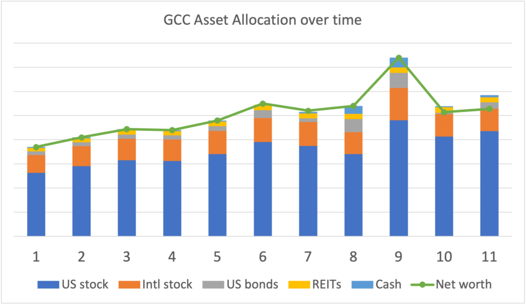
GCC Asset Allocation
As of late June 2023, our portfolio looks like this (chart from Empower.)

Assets and Allocation
The portfolio continues to be heavy on equities and light on bonds and cash, although I’ve recently increased our cash/short-term bond holdings (more on that later.)
Here is the breakdown:
US Stocks: 75% -> mostly VTI with some S&P500 and Small-cap trusts in my old 401k
International Stocks: 16% -> 100% VXUS
Bonds: 5% -> intermediate term Treasuries (IEI), very short term treasuries (individual), and I-bonds (included in this chart for the first time)
Alternatives: 4% -> 100% VNQ (a REIT) and REIT holdings as part of VTI (e.g. equities)
Cash: 1%
Some interesting ratios:
Stock / Bonds-Cash: ~ 94 / 6 (trending away from 100% equities)
US / International equities: ~ 82 / 18
Taxable / Pre / Post-tax: ~ 57 / 35 / 9 (Roth is trending up – was 0% 10 years ago)
Data from previous years: 2016, 2018, 2019, 2020, 2021, 2022.
What is new this year
Our cash and US bond holdings have increased by 3-4%, and the US/International stock allocation has skewed towards the US as markets here rose.
Bonds/cash increased because our regular cash flow is higher from a smaller portfolio – I wanted a cash buffer and not be forced to sell stock if the market dropped. With short-term Treasury rates at ~5% it made sense to park those funds there.
I also parked some funds from our mortgage investment experiment into I-bonds when those rates were nearly 10%.
Overall pretty minor stuff.
Changes over time
The portfolio snapshot from Empower is super helpful, offering a lot of insights at a single glance. I use it for easy rebalancing guidance…
The one thing it doesn’t show is changes over time, which really shouldn’t happen if you are rebalancing regularly… but if you do something untoward like trade some big gains for a house or increase bond allocation because interest rates jumped, well then it helps to see those changes visually.
As such, I also created some of my own charts. (Also because I like Excel a bit more than is rational.)

That same chart but in dollars (not inflation adjusted) rather than percentages
I don’t include home value in these charts because I don’t include equity in our retirement portfolio for purposes of the 4% Rule. However, seeing real assets (house, car, boat, aircraft, etc… minus debt) as part of the mix is interesting for many, so I made those charts this year as well (using Zillow valuations, which… probably optimistic.)


Some interesting data points:
- Even though we bought a house, our investment portfolio is worth more now than it was when we “retired” (not adjusted for inflation)
- Despite market behavior of the past few years, the trend is still up. Better than the alternative.
Other assets
Rewards Points
Not a traditional asset class, but something with real value.
Alaska Airlines: 166,940 miles
Amex: 0
Capital One: 0
Citi: 167,221
Delta Airlines: 17,274
Hilton: 27,051
IHG: 283.275
Marriott/SPG: 129,613
Ultimate Rewards: 230,430 (after recently booking $4,300 flights to Taiwan)
United Airlines: 12,429
Total value: $13,670+
We just got back from 2 weeks in Hawaii and will visit friends/family in Taiwan this winter, with rewards points covering most/all of the big expenses. I am currently working on spring break 2024 plans.
For the how and why of earning and spending rewards points, see: Introduction to Travel Hacking – Award Travel Series.
Crypto
If you enjoying owning things that have no intrinsic value, maybe you have some crypto. We do.
Some time ago I got $5 in free bitcoin from Paypal. This is included in the above charts but difficult to see, so I wanted to call it out specifically.
This is now worth $3.22, about $0.07 more than it was when I checked last year.

I also created my own coin – our holdings are worth a bit over $1 trillion dollars because I say so. This is NOT included in the above charts because it blows up the y-axis.
Social Security
At this point I am about 15 years away from being able to collect Social Security.
That has measurable impact on portfolio value today, as much as $750,000. That much cheese is kinda hard to ignore.
If the past few years of sideways / roller coaster markets has got you down, be sure to read that post for a breath of fresh air.
Summary
As homeowners we have a bit higher cash flow needs than we did as renters. With short term interest rates at 5%+ levels I sold some stock and parked cash in short term Treasuries. The rest of the portfolio is much the same as it has always been.
You can’t go wrong tracking your portfolio with Empower (affiliate link)


Hi GCC,
What age do you think you will start withdrawing from SS? I’m 42 right now and using the SS calculator it looks like 67 ($3000) might be better but goes up a lot at 70 ($4200). How are you factoring this in retirement income?
Sid
Ignore my question above…I found your post on SS…thanks!
I’ll prob take at age 62. I can’t bequeath my SS.
I have a few thoughts here. I’m 43 and my family of 5 is FI as of the beginning of this year. Being conservative, in the SS calculation I zero out all future earnings for both my wife and I. This will provide us an income floor for SS. I then take the lower SS income at 62, and the higher at 70 for the higher survivor SS income. I consider this a worse case outcome and likely something you can depend on for future income. Its also flexible if your situation or market (sequence of returns) changes as you approach 62 allowing you to change the age both you and your spouse choose to start SS.
Preach.
Also allows assets to continue to grow, should come out far ahead.
Amen my Friend!
Most likely come out ahead. But if you live a long time, or a surviving spouse lives a long time, the ROI on delaying SS can exceed average stock market returns. (external link to Kitces)
Now… how to guarantee you live a really long time? :)
(This also assumes no benefit cuts… which seems unlikely.)
All that said… I’m still likely to start collecting at 62.
Pretty standard and prudent allocation, nice. At least you’re using your money for things that matter in your life. And her you got that EV! I’m starting to add a little ESG to my mix over here.
Standard and prudent? That isn’t what anybody said 10 years ago
You guys are doing well but isn’t anyone that would have retired 10+ years ago should have way more than they started with because of insane market performance during that exceptional decade. Or am I missing something?
Have you look at the yearly performance of your portfolio since you retire? I’m betting it is above 10% right?
Regarding SS, I checked the post you linked but I’m yet to find a way to estimate how much SS I would get by the team I’ll be 65. The SS website provide me an estimation but I don’t believe that estimation account for no more income between now and the time I’ll retire. Is there a way to force the calculate to assume no more income since we retired in our 30s? (5 years ago already).
Why would you think there is something to miss?
I think they are missing the fact that you also spent down your savings/earnings for the last 10 years so if that were added back into the equation, it would account for not having “way more than you started with”.
We do have way more than we started with
> Is there a way to force the calculate to assume no more income since we retired in our 30s?
Yes. When you log into your SSA account, scroll down to the Plan For Retirement section. There are three tabs under there, the middle one is Average Future Annual Salary. It defaults to your last year’s earnings. Change it to $0.
I understand you (very reasonably) don’t provide numbers on your net worth. But if the scale for the green net worth lines is correct, then your net worth ballpark doubled in the decade from 2013 to 2023. That’s in line with money in the stock market doubling every decade, give or take.
Double Double
Very nice! Reading your blog and others, it seems there are two fundamental rules of thumb: (1) Money in the stock market doubles about every 10 years. (2) The 4% rule. Everything else is details.
Thus, saving $25k a year in your 20s is equivalent to saving $100k a year in your 40s. That’s what I would emphasize to my younger self.
That seems like a good thing to emphasize.
As with most systems, the 80/20 rule applies. Save early, invest in equities is the 80.
20% is still significant. Tax minimization, etc… can have large benefits. But saving a little more resolves all issues.
Don’t forget inflation. If that is 3% then even if you watch your asset values double over the course of a decade, 1/3 of that gain in purchasing power has eroded.
As long as returns are greater than inflation in retirement, inflation doesn’t matter much, in my opinion.
I just make sure I spend less than our income, so that I can inflation proof the future. I’m 47, have been early retired for six years now, doing this (wife doesn’t work either).
I recently noticed that on Empower they break down your allocation to international, large, med and small cap and have suggested allocations compared to your current allocation. Do you follow those recommendations?
No
you’ve picked some of the best ghostwriters for sure
ooooooohhhhh
Hopefully I’ll get back to writing personally in 2024.
” I wanted a cash buffer and not be forced to sell stock if the market dropped”
That’s very interesting….if I recall correctly, you once posted for companies to stop paying dividends because that is not smart. Now it seems you like some income. How things changed…and think that I almost changed my DGI portfolio when I read that post….glad I didn’t, now I don’t ever need to sell shares (market down or going up) to pay my bills
It is good to be pleased with your investment choices, but… No. On so many levels, no.
Investing for dividends is not smart. DGI in general is choosing to accept lower long-term investment returns in exchange for the illusion of security and consistent income. It also often comes comes wrapped in ignorance and sanctimony.
For a repeat of why investing for dividends is not smart: Fewer Dividends, Please.
For a refresher on why I sell some stock every year to fund our lifestyle: How Do I Live Off Just Dividends?
In this particular post I mention how I keep a larger cash buffer (basically to cover our spending for the current year) because we are spending more from a smaller portfolio. There is nothing more to read into it.
Hello Curry, one simple question, i noticed your investment on VXUS, but this Vanguard stock didn’t make any money for the past 7 months. Isn’t it better to put more money on VTI? currently I have 80% on VTI and around 16% on VXUS. Thank you
If your portfolio plan has international equities, then your portfolio should have international equities. If one fund goes down and another goes up, then you balance the portfolio by selling the UP fund and buying more of the DOWN fund. What you are describing is called market timing / performance chasing.